


Earned Value Management Demystified
Dash360 is a full project lifecycle application, and once your Performance Measurement Baseline is in place, Earned Value Management is no longer a heavy lift with Dash360’s EVM module. Accurate data, fast variance identification, and a clear record of what your team reported and when are all built in. Calculate earned value with one click, and a full suite of reports is immediately available.
- Contract Performance Report (CPR). See Schedule and Cost Variances by CAM and WBS, with current-period and cumulative-to-date views side by side. Variance thresholds highlight the numbers that need attention, and your team can enter narrative explanations directly on the report.
- Earned Value Curves. A clean line graph plots your Budget, Earned, and Actual cost classes month by month or year by year. Spot trends, compare periods, and communicate project health without building a chart from scratch.
- Earned Value Metrics. Planned Value, Earned Value, Actual Costs, Budget at Completion, Schedule Variance, Cost Variance, SPI, CPI, and EAC are calculated automatically from your baseline and actuals. No manual formulas, no reconciliation.
- Period-by-period and Cum-to-date Views. Whether your audience needs a snapshot of the current period or a full cumulative picture, the data is organized and ready.
One click to calculate. Every metric in one place. Always audit-ready.
Earned Value Management
")
")
The CPR Report
The Contract Performance Report puts your full earned value picture in one place, organized by WBS and work package. Variance thresholds flag cost and schedule problems the moment they appear, so nothing slips through between reporting periods.
- Drill down by WBS or work package. Expand and collapse the hierarchy to move from project-level summary to work package detail in seconds.
- Pivot by Control Account Manager. Instantly regroup the data by CAM to see who owns the variances and where corrective action is needed.
- Current period and cumulative to date, side by side. Planned, Earned, Actual, SV, CV, BAC, EAC, SPI, and CPI are all on one screen, with no toggling between views.
- Every reporting period saved automatically. Go back to any monthly snapshot at any time for historical detail, trend analysis, or audit support.
All Your CPR Metrics Exactly the Way You Need Them
The CPR is built for the way your team actually works. Save custom layouts, choose the columns you need, and group data the way your reporting requires, all without touching a spreadsheet.
- Drag and drop columns for pivot-style grouping. Reorganize the report on the fly to slice data by CAM, WBS, or any grouping that fits your review.
- Custom views for every audience. Create and save layouts for different stakeholders so the right people see exactly what they need, every reporting period.
- Variance thresholds with automatic highlighting. Values outside your defined range for cost variance, schedule variance, CPI, and SPI are instantly flagged in the report.
- Choose the columns you want to see. Show or hide current period, cumulative to date, indexes, and more to keep the report focused and readable.
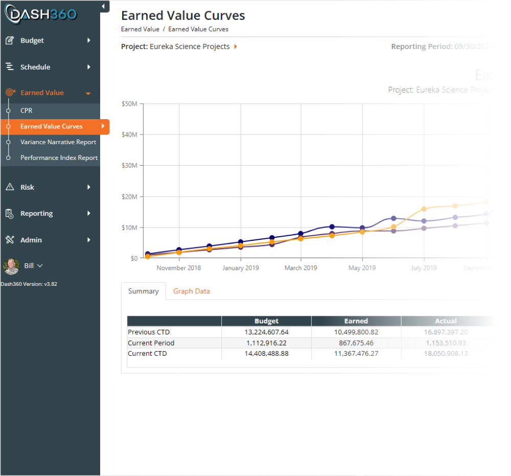
Earned Value Curves for Instant Project Insight
The Earned Value Curves report gives you an instant visual read on project health, with budget, earned, and actual costs plotted as a clean line graph by reporting period. Filter by month, year, or a specific WBS element to focus the view exactly where you need it.
- At-a-glance cost curve comparison. Budget, Earned, and Actual cost lines plotted together so trends and divergences are immediately visible.
- Drill into any WBS or reporting period. Narrow the graph to a specific element or timeframe without losing the surrounding context.
- Supporting data table included. Schedule Variance, Cost Variance, CPI, SPI, and At Complete figures are displayed in a grid below the graph so the numbers back up what the curves are showing.
- Download the chart and the data. Export both the graph and the data table so you can drop them directly into presentations and reports.
CPI and SPI Trends at a Glance
The Performance Index Report plots your Cost Performance Index and Schedule Performance Index side by side across every reporting period, so you can see at a glance whether performance is improving, holding, or slipping. A supporting data table below the graph gives you the exact SPI and CPI value for each period.
- Monthly or yearly view. Toggle between monthly and yearly formats to match the level of detail your review requires.
- Period-by-period trend lines. CPI and SPI plotted together over time so diverging trends are visible before they become problems.
- Drill down with built-in filters. Narrow the report by WBS, work package, CAM, or date range to focus performance analysis exactly where it is needed.
")
Earned Value Curves for Instant Project Insight
The Earned Value Curves report gives you an instant visual read on project health, with budget, earned, and actual costs plotted as a clean line graph by reporting period. Filter by month, year, or a specific WBS element to focus the view exactly where you need it.
- At-a-glance cost curve comparison. Budget, Earned, and Actual cost lines plotted together so trends and divergences are immediately visible.
- Drill into any WBS or reporting period. Narrow the graph to a specific element or timeframe without losing the surrounding context.
- Supporting data table included. Schedule Variance, Cost Variance, CPI, SPI, and At Complete figures are displayed in a grid below the graph so the numbers back up what the curves are showing.
- Download the chart and the data. Export both the graph and the data table so you can drop them directly into presentations and reports.
CPI and SPI Trends at a Glance
The Performance Index Report plots your Cost Performance Index and Schedule Performance Index side by side across every reporting period, so you can see at a glance whether performance is improving, holding, or slipping. A supporting data table below the graph gives you the exact SPI and CPI value for each period.
- Monthly or yearly view. Toggle between monthly and yearly formats to match the level of detail your review requires.
- Period-by-period trend lines. CPI and SPI plotted together over time so diverging trends are visible before they become problems.
- Drill down with built-in filters. Narrow the report by WBS, work package, CAM, or date range to focus performance analysis exactly where it is needed.
Place Holder 1
Sample copy
Place Holder 2
Sample copy
")
")
")
Complete Visibility Into Variances & Narrative Status
The Variance Narrative Report gives administrators and CAMs a single view of where narratives stand across the entire project. Color-coded variance cells show at a glance which work packages are flagged, in progress, or complete, with earned value metrics right alongside them for context.
- Filter to what matters. Show all work packages, only those tripping a threshold, only completed narratives, or only those still missing a required explanation.
- Drill down by WBS or CAM. Collapse and expand the hierarchy or filter by Control Account Manager to focus the review on the right subset of work.
- Metrics and narratives in one place. Planned, Earned, Actual, SV, and CV are displayed alongside narrative status so the numbers and the explanations never get separated.
Variance Narratives Collected, Stored, and Ready to Export
Stop collecting variance narratives by spreadsheet and email. Dash360 brings the entire narrative workflow into the CPR, where your team sees the variances, enters their explanations, and submits them directly to the administrator without leaving the system.
- Threshold-driven prompts. When a variance trips a defined threshold, Dash360 flags it automatically so CAMs know exactly where a narrative is required.
- Configurable narrative fields. Define the fields you want to collect for each variance type, keeping responses structured and consistent across the team.
- Current period and cumulative to date. Narratives can be entered and reviewed for both views, with a copy-forward option to pull the prior period narrative as a starting point.
- Built-in submission and export workflow. CAMs submit narratives to the administrator through the Variance Narrative Report, which can be exported for use in formal deliverables and reviews.
Export Narratives Directly to Word or Excel
Once your team has completed their narratives in Dash360, the Variance Narrative Report exports directly to Word or Excel. No copying, no assembly, no reformatting. The report arrives structured and ready to drop into your formal project review package.
- Export to Word or Excel. Choose the format that fits your deliverable, whether it is a formal CPR submission or an internal review document.
- Work package metrics included. Planned, Earned, Actual, SV, and CV travel with the narratives so the numbers and explanations stay together in the export.
- Configurable narrative fields. Summary, explanation, impact, and corrective action are included by default, and every field is configurable so the export matches exactly what your reviewers expect to see.
")
CPI and SPI Trends at a Glance
Once your team has completed their narratives in Dash360, the Variance Narrative Report exports directly to Word or Excel. No copying, no assembly, no reformatting. The report arrives structured and ready to drop into your formal project review package.
- Export to Word or Excel. Choose the format that fits your deliverable, whether it is a formal CPR submission or an internal review document.
- Work package metrics included. Planned, Earned, Actual, SV, and CV travel with the narratives so the numbers and explanations stay together in the export.
- Configurable narrative fields. Summary, explanation, impact, and corrective action are included by default, and every field is configurable so the export matches exactly what your reviewers expect to see.
Placeholder
Sample copy