


Enterprise Reporting
Dash360 embeds reporting throughout every module, so the data you enter is always one step away from a chart, a table, or a submission-ready document. From work package estimates to earned value performance to risk exposure, every report draws from the same integrated dataset so your numbers are always consistent across audiences.
- Budget and Estimate Reports. WBS Summary, Cost Summary, Work Package, and Staffing Plan reports roll up the project estimate at any WBS level, with breakdowns by estimate type, resource type, cost type, and FTE.
- Earned Value Reports. CPR Formats 1 through 5, RAM, EV Curves, and PI Index reports give program offices and sponsors the performance visibility they require, all generated directly from your Performance Measurement Baseline.
- Risk Reports. Burndown charts, tornado charts, and direct cuts from the Risk Register communicate risk exposure clearly, with no third-party tools required.
- Quality Check Reports. Verify data completeness across the project with reports that flag unpopulated fields in the WBS Dictionary, Basis of Estimate, Activity IDs, and other critical data elements before they become review findings.
- Stakeholder and Submission Reports. The Cost Estimate Detail Report and NSF Format 1030 are built in and ready to export, supporting proposal submissions and external reviews without manual assembly.
- Custom Report Design. Dash360 experts can design and publish custom reports tailored to your project’s specific reporting requirements, extending the platform’s standard library when your needs go beyond the built-in set.
The reports you need, the flexibility to make them yours.
Enterprise Reporting


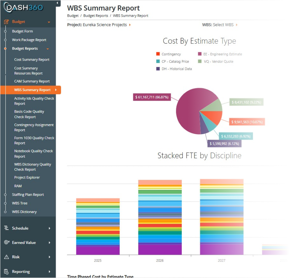
The WBS Summary Report
A comprehensive visual summary of the project estimate broken down by WBS element. Includes multiple charts and supporting data tables:
- Cost by Estimate Type: breaks down the estimate by methodology (Parametric, Analogy, Engineering, Grassroots, etc.)
- Cost by Resource Type: Labor, Non-Labor, Travel split
- Cost by Cost Type: breaks cost into configured cost types
- FTE Analysis: full-time equivalent labor across WBS elements
- Stacked cost subtotals: rolled-up totals at each WBS level
The Work Package Report: Where it all comes together.
Summary and detail for each work package, all in one place.
The Work Package Report provides summary information for each work package that can be expanded to detail layers, giving your team a complete, consolidated view of each work package’s full cost picture on a single screen. No navigating between screens. No piecing together data from multiple sources. Time-phased views at every level. Easily switch between yearly, quarterly, and monthly views of your cost data instantly. Whether you are presenting to leadership or verifying a CAM’s monthly spend profile, the right level of detail is one click away.
Rounding out the Work Package Report is a complete view of schedule activities, CPR performance data, user-defined fields, and all attached files and links.
- User Defined Fields. Project-specific details like estimator, location, and any custom fields configured for your project.
- Schedule Activities. All linked activities with start and finish dates, displayed directly within the work package.
- CPR Data. Current period and cumulative EV metrics, including SV, CV, BAC, and variance at completion.
- Attachments and File Links. BOEs, vendor quotes, planning spreadsheets, and external references, all consolidated at the work package level and accessible in one place.
Cost Summary Report
See a summary version of your entire project cost structure organized by WBS hierarchy, with every work package’s labor, non-labor, travel, contingency, and total costs rolled up and expandable at every level. Collapse to a high-level summary or drill all the way down to individual work packages. Filter by WBS level, cost class, and more, and export to Excel in one click.
Staffing Plan Report: Know Who You Need and When
Project Explorer: Dig Deeper with Time-phased Views
Drill into the fully burdened cost detail behind every resource assignment. FTE, hours, direct costs, escalation, fringe, and indirect charges are all broken out by resource and work package across the fiscal year timeline. When you need to understand exactly what is driving a number, the Project Explorer has the answer.
Contingency Assignment Report: Bottoms Up Contingency Calculations
See every contingency assignment across the project, broken down by the technical, cost, and schedule risk factors that drive each percentage. Rolled up through the WBS hierarchy so you can audit contingency coverage at any level, from individual resource assignments all the way to the project total.


")

")
Your Schedule, Your Way
See every activity, dependency, and critical path in one interactive view. Dash360’s Schedule Viewer lets project teams navigate the full schedule hierarchy, trace predecessor and successor logic, and zero in on what’s driving the timeline.
- Critical path at a glance. Color-coded Gantt bars highlight driving activities so teams can immediately see what matters most.
- Full logic traceability. Click any activity to instantly surface its predecessors, successors, relationships, and float values in the detail panel below.
- WBS-structured navigation. The schedule rolls up naturally by Work Package, making it easy to drill from summary level down to individual activities.
- Baseline and period comparison. Compare current dates against the baseline or prior month to track schedule movement and spot slippage before it becomes a problem.
- Custom views, saved and ready. Configure columns, grouping, and sorting to match how your team works, then save the view for instant recall.
Cost & Schedule Integration: Resource Loading Has Never Been Easier
Dash360 bridges the gap between schedule and cost, giving project teams a single view to understand not just when work happens, but what it costs.
- Activity-level resource detail. Select any schedule activity to see its full resource assignment list, including labor categories, named staff, and professional services.
- Flexible result display. Toggle between Dollars, Hours, or FTEs to view resource assignments in the units that matter most to your audience.
- Time-phased at a glance. Budget values spread across months in a synchronized Gantt panel, so resource loading is visible in context with the schedule.
- Spot misalignment fast. Quickly identify where cost and schedule are out of sync, so disconnects can be resolved before they affect project performance.
Quick Status
Quick Status is a streamlined tabular view designed to make schedule updates fast. Clicking a scheduled date instantly populates the actual start or finish field, which can then be adjusted as needed. CAMs update percent complete and add comments directly in the grid, with color coding showing what is complete, in progress, or not started. WBS level filters and a hide-completed toggle keep the working list focused
Labor Estimate
Labor Resource Assignments
Staffing Plan Report: Know Who You Need and When
View your full FTE distribution year by year or month by month, broken out by individual resource across the project timeline. Spot over-allocations before they become problems, cross-reference your staffing plan against the schedule to make sure the two align, and share a clean, exportable workforce picture with sponsors and the Project Management Team.
")
")
")
")
")
")
")
The CPR Report
The Contract Performance Report puts your full earned value picture in one place, organized by WBS and work package. Variance thresholds flag cost and schedule problems the moment they appear, so nothing slips through between reporting periods.
- Drill down by WBS or work package. Expand and collapse the hierarchy to move from project-level summary to work package detail in seconds.
- Pivot by Control Account Manager. Instantly regroup the data by CAM to see who owns the variances and where corrective action is needed.
- Current period and cumulative to date, side by side. Planned, Earned, Actual, SV, CV, BAC, EAC, SPI, and CPI are all on one screen, with no toggling between views.
- Every reporting period saved automatically. Go back to any monthly snapshot at any time for historical detail, trend analysis, or audit support.
All Your CPR Metrics Exactly the Way You Need Them
The CPR is built for the way your team actually works. Save custom layouts, choose the columns you need, and group data the way your reporting requires, all without touching a spreadsheet.
- Drag and drop columns for pivot-style grouping. Reorganize the report on the fly to slice data by CAM, WBS, or any grouping that fits your review.
- Custom views for every audience. Create and save layouts for different stakeholders so the right people see exactly what they need, every reporting period.
- Variance thresholds with automatic highlighting. Values outside your defined range for cost variance, schedule variance, CPI, and SPI are instantly flagged in the report.
- Choose the columns you want to see. Show or hide current period, cumulative to date, indexes, and more to keep the report focused and readable.
Earned Value Curves for Instant Project Insight
The Earned Value Curves report gives you an instant visual read on project health, with budget, earned, and actual costs plotted as a clean line graph by reporting period. Filter by month, year, or a specific WBS element to focus the view exactly where you need it.
- At-a-glance cost curve comparison. Budget, Earned, and Actual cost lines plotted together so trends and divergences are immediately visible.
- Drill into any WBS or reporting period. Narrow the graph to a specific element or timeframe without losing the surrounding context.
- Supporting data table included. Schedule Variance, Cost Variance, CPI, SPI, and At Complete figures are displayed in a grid below the graph so the numbers back up what the curves are showing.
- Download the chart and the data. Export both the graph and the data table so you can drop them directly into presentations and reports.
Performance Indexes: CPI and SPI Trends at a Glance
Once your team has completed their narratives in Dash360, the Variance Narrative Report exports directly to Word or Excel. No copying, no assembly, no reformatting. The report arrives structured and ready to drop into your formal project review package.
- Export to Word or Excel. Choose the format that fits your deliverable, whether it is a formal CPR submission or an internal review document.
- Work package metrics included. Planned, Earned, Actual, SV, and CV travel with the narratives so the numbers and explanations stay together in the export.
- Configurable narrative fields. Summary, explanation, impact, and corrective action are included by default, and every field is configurable so the export matches exactly what your reviewers expect to see.
Complete Visibility Into Variances & Narrative Status
The Variance Narrative Report gives administrators and CAMs a single view of where narratives stand across the entire project. Color-coded variance cells show at a glance which work packages are flagged, in progress, or complete, with earned value metrics right alongside them for context.
- Filter to what matters. Show all work packages, only those tripping a threshold, only completed narratives, or only those still missing a required explanation.
- Drill down by WBS or CAM. Collapse and expand the hierarchy or filter by Control Account Manager to focus the review on the right subset of work.
- Metrics and narratives in one place. Planned, Earned, Actual, SV, and CV are displayed alongside narrative status so the numbers and the explanations never get separated.
Variance Narratives Collected, Stored, and Ready to Export
Stop collecting variance narratives by spreadsheet and email. Dash360 brings the entire narrative workflow into the CPR, where your team sees the variances, enters their explanations, and submits them directly to the administrator without leaving the system.
- Threshold-driven prompts. When a variance trips a defined threshold, Dash360 flags it automatically so CAMs know exactly where a narrative is required.
- Configurable narrative fields. Define the fields you want to collect for each variance type, keeping responses structured and consistent across the team.
- Current period and cumulative to date. Narratives can be entered and reviewed for both views, with a copy-forward option to pull the prior period narrative as a starting point.
- Built-in submission and export workflow. CAMs submit narratives to the administrator through the Variance Narrative Report, which can be exported for use in formal deliverables and reviews.
- Filter to what matters. Show all work packages, only those tripping a threshold, only completed narratives, or only those still missing a required explanation.
- Drill down by WBS or CAM. Collapse and expand the hierarchy or filter by Control Account Manager to focus the review on the right subset of work.
- Metrics and narratives in one place. Planned, Earned, Actual, SV, and CV are displayed alongside narrative status so the numbers and the explanations never get separated.
Export Narratives Directly to Word or Excel
Once your team has completed their narratives in Dash360, the Variance Narrative Report exports directly to Word or Excel. No copying, no assembly, no reformatting. The report arrives structured and ready to drop into your formal project review package.
- Export to Word or Excel. Choose the format that fits your deliverable, whether it is a formal CPR submission or an internal review document.
- Work package metrics included. Planned, Earned, Actual, SV, and CV travel with the narratives so the numbers and explanations stay together in the export.
- Configurable narrative fields. Summary, explanation, impact, and corrective action are included by default, and every field is configurable so the export matches exactly what your reviewers expect to see.
")
")
")
")
")
")
")
")
Risk Register: Turn Known Unknowns Into Managed, Quantified Risk.
The Dash360 Risk Register gives your team a structured, centralized home for every threat and opportunity on the project. The Dash360 Risk Register goes beyond logging risks. Your team defines the appropriate response strategy for each risk, whether that is mitigate, transfer, accept, or avoid, then runs native Monte Carlo simulations to compare pre- and post-response cost exposure side by side. You don’t just manage risk, you quantify the value of managing it well.
- Structured risk logging. Capture risk ID, title, description, category, type, cost and schedule impact, and handling strategy in a consistent, fully customizable format across the team.
- Owner accountability built in. Assign a named risk owner and action owners so every risk has a responsible party, not just a record.
- Status visibility at a glance. Track whether each risk is proposed, active, realized, retired, or deprecated so your register always reflects the current state of the project.
- Full mitigation planning included. Capture treatment strategies, action plans, risk distribution, and key dates directly alongside each risk record.
Risk Heatmaps: Your Complete Threat and Opportunity Picture at a Glance
The Risk Register Heatmaps translate your entire risk inventory into color-coded severity grids across Cost, Schedule, and Risk Ranking, for both threats and opportunities. Leadership gets an immediate read on where exposure is concentrated and where the project has potential upside, without combing through rows of data.
- Separate threat and opportunity heatmaps. Threats plot in red, yellow, and green by severity. Opportunities display in a separate blue-coded grid so upside potential is visible alongside downside risk.
- Three views per classification. Cost, Schedule, and Risk Ranking grids display simultaneously, each plotting likelihood against impact so the full exposure picture is visible in a single screen.
- Instant prioritization. Red cells flag the high-probability, high-impact risks that need immediate attention in every review meeting.
- Click to filter. Clicking any heatmap cell instantly filters the risk register to just those risks and drives all downstream reports from that selection, so your review meeting can go from the big picture to the specific risks in a single click.
- Project-defined thresholds. Every project configures its own probability and impact ranges so the heatmap calibration reflects your project’s specific risk tolerance and scoring criteria, not a generic default.
Monte Carlo
Dash360’s native Monte Carlo engine aggregates every risk in your register and simulates total project cost and schedule exposure across thousands of iterations, no third-party tools required. The real value is in the discipline of thinking through every risk scenario and its response. The simulation result gives you a key data point you can point to when making the case for your contingency estimate.
- Project-level cost and schedule simulation in seconds. Set the number of iterations, choose a scenario, and run. Results return immediately as a full frequency distribution and cumulative probability curve.
- Pre- and post-response comparison in one chart. See unmitigated and mitigated exposure plotted side by side so the impact of your mitigation plan is visible at every confidence level.
- A contingency data point grounded in your risks. Percentile summary tables show pre-response, post-response, reduction, and percent improvement, giving your team a simulation-backed reference point for cost and schedule contingency decisions.
- Saved simulation history. Previous simulations are stored and available for comparison so your team can track how risk exposure has changed over time as mitigations are implemented.
- Scenario modeling. Run simulations against different mitigation scenarios to compare approaches and identify the response strategy with the greatest impact on exposure.
Run the scenarios. Arrive at a number you can stand behind.
Risk Drivers: See the Trends. Find the Sources. Focus the Response.
Understanding total risk exposure is only half the story. Dash360 shows you how that exposure has trended over time by individual risk, and which schedule activities are carrying the most risk weight, so your team knows exactly where to focus mitigation effort for the greatest impact.
- Cost exposure by risk over time. A stacked bar chart plots each risk’s individual cost exposure monthly, so your team can see which risks are driving the most exposure and how that picture has changed across the project lifecycle.
- Activity drivers analysis. Identifies which schedule activities carry the highest total risk exposure, with each bar broken down by the contributing risks, so the connection between schedule work and risk impact is always visible.
- From total exposure to root cause. Move from the project-level Monte Carlo number down to the specific risks and activities behind it, giving your team a clear line of sight from the contingency estimate to what is actually driving it.
Know your drivers. Target your response.
Sensitivity and Delta Analysis: See What's Driving Exposure
- Cost exposure by risk over time. A stacked bar chart plots each risk’s individual cost exposure monthly, so your team can see which risks are driving the most exposure and how that picture has changed across the project lifecycle.
- Activity drivers analysis. Identifies which schedule activities carry the highest total risk exposure, with each bar broken down by the contributing risks, so the connection between schedule work and risk impact is always visible.
- From total exposure to root cause. The sensitivity tornado chart ranks your top cost risk drivers by their high and low impact range, so your team immediately knows which risks have the most leverage on total project cost. The Delta Analysis panel then measures whether your mitigation responses are actually moving the needle, comparing net cost and schedule exposure before and after response across the entire risk register. Tornado chart of top risk drivers. Ranks the top 10 risks by cost impact range, plotting both low and high impact scenarios so the risks with the greatest influence on total exposure are immediately identifiable.
- Pre- and post-response delta for cost and schedule. Net cost exposure change and net schedule exposure change are calculated across all risks, with pre- and post-response values displayed side by side so mitigation effectiveness is measured, not assumed. Positive and negative signals. Negative exposure changes confirm mitigations are working. Positive changes flag areas where responses may need to be revisited.
Monte Carlo by WBS: The Detail and the Rollup. All in One View.
The Monte Carlo by WBS table breaks simulation results down to the work package level and rolls them up through every level of the WBS automatically. No manual aggregation, no disconnected summaries, and no confusion about where the numbers come from.
- Full WBS hierarchy with automatic rollup. Parent rows aggregate their children at every WBS level so the relationship between work package exposure and total project exposure is always clear and always correct.
- Multiple percentile columns side by side. View P10, P50, P70, P75, P80, P90, and Mean in a single table so your team can read confidence levels across the full range without switching views.
- WBS level filtering. Collapse or expand to any level of the hierarchy and filter by WBS level to focus on the summary or the detail your audience needs.
- Excel download available. Pull the full table into Excel for reporting, stakeholder packages, or offline review with one click.
The rollup other tools can’t deliver
Exposure Comparison and Burndown
The Pre/Post Exposure Comparison shows the cost exposure impact of mitigation responses at the individual risk level, while the Risk Analytics Burndown tracks how total project risk exposure has trended over time. Together they give your team a complete picture of whether the mitigation program is working and where it still needs attention.
- Pre- and post-response comparison by risk. You define the colors of the bars in the plot each risk side by side so the cost exposure reduction from mitigation responses is visible at the individual risk level across the full register.
- Sortable by greatest improvement. Reorder the chart by the risks showing the most mitigation impact so leadership can see where the response program is delivering the most value.
- Risk cost exposure burndown over time. Tracks total risk cost exposure across the project lifecycle so your team can see whether overall exposure is declining as the project matures and mitigations take hold.
Schedule Risk Analysis: The Same Monte Carlo Rigor, Applied to Your Schedule
Dash360 applies the same Monte Carlo rigor to schedule risk that it brings to cost, simulating project finish dates across thousands of iterations and surfacing the schedule contingency needed to meet your confidence targets. The Validation and Status panel confirms your uncertainty data quality upfront so you know your inputs are complete before the simulation runs.
- Uncertainty data quality check first. The system shows how many activities carry min/ML/max data versus uncertainty class assignments, with a percentage complete so any gaps are visible before they affect results.
- Finish date distribution at every confidence level. P50 and P80 finish dates, a full frequency distribution, and a cumulative probability curve give your team a complete read on schedule confidence across the full range.
- Schedule contingency in plain terms. Contingency required is expressed in days at your target confidence level, giving schedule owners a simulation-backed number they can stand behind.
- Integrated with your risk register. Schedule risk simulation draws directly from the risk and uncertainty data your team already maintains, no separate input process or disconnected tool required.
")
")
")
")
WBS Dictionary Quality Check Report
Know exactly where your WBS Dictionary is incomplete before it becomes a problem. The Quality Check Report scans every WBS element and gives you an instant at-a-glance view of what is populated and what still needs attention, across both standard and custom fields.
- Flag missing WBS Owners, Key Milestones, Dependencies, Acquisition Strategy entries, and Notes at every level of the hierarchy.
- Extend quality checks to any custom notebook field you create, so your specific data requirements are enforced the same way as built-in fields.
Custom Notebook Fields Quality Check Report
Work package custom fields hold the detail behind your budget, and incomplete entries create gaps in your project record. The Notebook Quality Check Report surfaces every missing field across all work packages so nothing slips through before a review or submission deadline.
- Instantly see which work packages are missing key entries like Work Package Description, Basis of Estimate, Location, and OBS.
- Scan across the full WBS hierarchy to catch gaps at any level, from summary elements down to individual work packages.
Risk Quality Check Report
A risk register is only useful if it is complete. The Risk Quality Check Report scans every risk entry and shows exactly which fields are populated and which are missing, so your team can maintain a fully documented register ready for any review.
- Check completeness across all key risk fields including Title, Description, Category, Type, Status, Handling Strategy, Trigger Date, WBS, Work Packages, Activities, and Owner.
- Spot risks with stale or missing Last Reviewed Dates to keep your register current and audit-ready.
- Filter and group results to prioritize cleanup by risk ID, WBS, or any other column.
Activity IDs Quality Check Report
Schedule activities and budget work packages have to stay in sync. The Activity IDs Quality Check Report compares your schedule activity assignments against your budget WBS structure and flags any activity where the two do not align.
- Identify activities where the WBS may be misaligned, catching cost-schedule integration errors before they affect performance reporting.
- The Valid Activity flag can quickly highlight problem records and take corrective action in your schedule or budget data.
")
")
")
")
")
Your Data Called. It Wants the Right Chart
Start with the output you want. Dash360 gives you nine report types to choose from, so you can match the format to the story before you build a single report.
- Flat Data Grid and Pivot Grid. Tabular layouts for detailed cost breakdowns, cross-tabular analysis, and drag-and-drop field configuration.
- Bar and stacked chart options. Side-by-side bars for comparisons, stacked bars for part-to-whole relationships, all with clean legend and data table output.
- Trend and area charts. Line, spline, and area charts surface how costs and performance move over time.
- Pie and doughnut charts. Proportional views for budget composition and expenditure category analysis.
All Your Reports, Organized and Ready to Run
The Report Viewer keeps every custom and standard report in one gallery. Switch between grid and list view, see report type at a glance, and open any report in a single click.
- Visual gallery layout. Thumbnail previews let you spot the right report without opening each one.
- Report type badges. Pivot, Stacked Bar, Data Grid, and Budget vs Actual labels tell you exactly what you are opening before you click.
- Grid and List toggle. Switch views depending on how many reports you manage and how you prefer to navigate.
- Shared report library. Reports created by any team member are visible across the organization, keeping the whole team working from the same source.
Side-by-side, Where Analysis Starts
The side-by-side bar chart allows for a variety of comparisons at summary or detail levels.
- Project Year comparisons. Bar clusters by project year show Labor, Non-Labor, and Travel together for instant trend recognition.
- Integrated data table. Every chart bar ties directly to a formatted table with totals by resource type and grand totals by year.
- Export ready. One click puts the full report, chart and table, in an exportable format for stakeholder distribution.
- Filters panel. Scope the report to any subset of the project without touching the underlying data.
Your Full Cost Picture, Rolled Up and Drilled Down
The pivot report gives you an instant, hierarchical view of project costs across any combination of WBS levels, resource types, and time periods. Expand, collapse, and filter on the fly without rebuilding the report.
- Full WBS hierarchy. Roll up or drill down across any level of the work breakdown structure from a single view.
- Resource type columns. Labor, Non-Labor, and Travel break out side by side with grand totals at every level.
- Live controls. Expand All, Collapse All, Refresh, and Export keep the report current and ready to share.
- Field Chooser and Default View. Add or remove fields and apply saved views without leaving the report.
Your Project, Your Report, Your Way
The Custom Report Designer puts full pivot configuration in your hands. Drag fields into place, set filters, and watch the report render live on the right as you work.
- Drag-and-drop field placement. Assign any of 81 available fields to rows, columns, data, or filter zones with a simple drag.
- Live preview. The report renders in real time as you configure it, so there is no guessing about the output.
- Multiple filter controls. TimePhase Year, WBS Level, Cost Class, and Currency filters scope the data precisely before you save.